What’s the big deal with website bounce rate? Why bother with it at all? The answer is simple. A high website bounce rate is costing you in terms of search engine rankings and in terms of serving your customers’ needs.
Both of these things cost you money, which means in the end, your business is constantly losing revenue. This is why bounce rate is so important.
Tweaking something as simple as this could mean the difference between losing to your competition or blowing them out of the water. If you are ready to take your business to the next level, here is how to improve website bounce rate.

WHAT IS BOUNCE RATE?
A bounce is the term used to define a situation where a reader comes to your site and takes a quick look at a single page or post then leaves, without clicking any links or visiting any other pages.
The number of times that readers bounce on your site or posts within a given period of time is your bounce rate. Ideally, you want to make sure that your bounce rate is as low as possible.
A high bounce rate is a problem. Usually, it means one of or all of three things:
- You are attracting the wrong visitors. If your site is reaching people who have no interest in your product or services, chances are they will bounce at a higher rate than normal. You need to make sure that your content gets to your target niche.
- The visitor is not finding what they are looking for. When the visitor loads your site, the information they need must be as easy to retrieve as possible. You need to put yourself in their shoes. What would you be looking for when you open up a site like yours? Is this information available immediately you see the home page, or at the very least retrievable in as few clicks as possible?
- Your visitors are having a crappy user experience. User experience, or UX for short, is very important when it comes to running a web-based business. People hate long loading times or cluttered web pages.
- You want to make your site as simple to use and as straightforward as possible. If you overwhelm your visitors with too much information or you annoy them with long loading times, they will likely not stay on the web page for long.
When you have a very high bounce rate, not only do you lose hard to get potential customers, but you also lose out with search engines.
Search engines calculate your bounce rate. If it is high, they rank you lower, because clearly, users are not interested in your content. When you rank low in search engines, there is very little chance that your content will ever get seen.
If you want to solve your bounce rate problems, here are a few tried and true solutions:

MAKE YOUR CONTENT LONGER
From personal experience, I have come to learn that articles of about 2000 words generally perform better than shorter ones. If you can write more than 2000 words, the better.
However, it is important to remember that your lengthy article should be packed full with useful information. Do not waste your readers’ time. They can tell. Never write long posts for the sake of writing long posts. Always make sure that you do in-depth research and break down your topic of focus completely.
You want your posts to be informative, full of helpful tips, and very thorough. If you do this, you will soon realize that 1500-2000 word articles will come relatively easy. Neil Patel has an awesome article about content length with data to back this up

IMPROVE THE USER EXPERIENCE
The overall user experience of your site must be top-notch. Your website is your first line of contact with potential customers.
If it is crowded, with pop-ups and banners all over, people will be out of there faster than you can blink. A cluttered and hard to navigate site will make everyone who is unfortunate enough to visit it to leave as soon as they set eyes on it.
This will rapidly increase your bounce rate and you will effectively lose money.
To improve your user experience, you need to:
- Make your posts more readable. Remember that no one likes huge chunks of content. Break your text into small paragraphs of three sentences max each. Add a large white space between paragraphs to further ease readability. You also need to use subheadings and bullet points to make your points more legible and digestible.
- Avoid popups as much as you can. Why? Simple, they suck! Literally, no one likes them. They rudely disrupt the reading flow of your pages and makes people leave. If you are going to use popups, you need to time them right and make them unobtrusive. It sounds so simple but the number of websites that break this rule is shocking.
- Give your audience fresh content. Your blog needs to be updated with fresh content regularly and at predictable intervals. Your users need to know that you update your site every X days. This is the only way to pique their curiosity and have them coming back to find out what you have posted.
- Before you get here, however, you need to make sure that your existing content has value and has helped you build the trust of your customers. This is how you create repeat visitors, which are the best kind of visitor there is.
USE MULTIPLE FORMS OF MEDIA
As a business person, you want to make sure that your readers engage with your content as much as possible. You want to have the best possible content to keep things constantly interesting. Mixing different media types is the best way to go about this.
A few rules of thumb:
- Make sure you have plenty of images to illustrate your point
- Have infographics to help the readers visualize a concept
- Never use only text
- Whenever possible, add video to show step by step processes
- Have PDF docs that can be downloaded and printed.
Imagine a fishing site. How helpful would a text-only site be? And how much more helpful would it be to have downloadable PDFs of fishing knots, videos on how to bait a hook or on how to set up a slip bobber? How helpful would an infographic be outlining the spawning habits of a certain type of fish?

MAKE YOUR SITE EASY TO NAVIGATE
We’ve all had that experience. You land on a site that looks promising, but you just can’t seem to find what you are looking for.
There is nothing more frustrating than feeling like you have no idea what you are doing when visiting a site. Everyone hates cluttered and complex sites. Make your site have the kind of experience that you would personally enjoy, that a 10-year-old and an 80-year-old alike would be able to navigate.
Find a simple theme and a simple design and use these on your site. Create categories to further ease navigation, and keep your logo and branding as simple as possible. Whoever said simplicity is the ultimate form of sophistication definitely knew what they were talking about.
FINAL THOUGHTS
Your website bounce rate is clearly an essential metric that you definitely need to have within your radar.
You need to monitor it closely because it can reveal some underlying issues with your site or content.
When people visit a single page or blog post on your site then leave, you need to reevaluate everything about how you are doing things and to find out where the problem is.
Perhaps you are attracting the wrong kinds of visitors, or your visitors are not finding what they are looking for. Perhaps your visitors are having an awful experience interacting with your site. You must be doing something wrong, and you need to figure it out as soon as possible, lest you lose vital potential customer numbers.
If you want to improve your website bounce rate, here is a summary of what you need to do:
- Make your content lengthier. Lengthier content retains users far better than short content does.
- Improve the user experience. Make sure your users are having an easy time interacting with your site.
- Use multiple forms of media. Keep things interesting. Using only text is boring, and will likely turn away potential visitors. Shake things up a bit with images and videos and infographics.
- Pick a simple theme and clean logos. Put your content in categories to make it easy to find
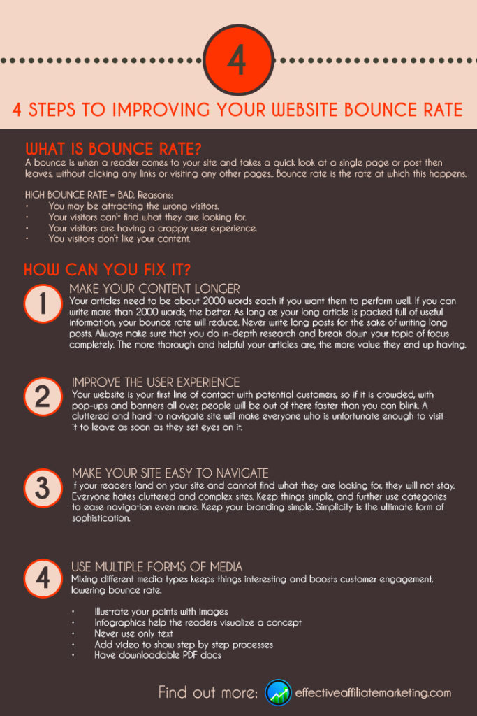
Here is a neat infographic that sums it all nicely!

Affiliate marketing is an amazing opportunity but it can be confusing. It is not very hard, but it can be f=difficult to keep all our ducks in a row. From website building, content creation and SEO, it can be a tough road to navigate.
What if I told you that there is a blueprint that you can follow to be successful in affiliate marketing? What if I told you that you can finally start earning money online with a proven step-by-step process with all the tools you need to succeed?
Well, there is such a blueprint. In fact it is the same one I use every day. it is the one I used to build this very site that you are now reading.
I wrote a comprehensive review that I hope will show you all the benefits you could get from this program. From tools to build your website in less than one minute, to step-by-step videos and lessons. Please give it a look as you have nothing to lose. You can even join for free!
CLICK HERE TO VISIT MY #1 RECOMMENDED AFFILIATE MARKETING TRAINING REVIEW!
I hope you enjoyed this post. Bounce rate is a big problem for many new affiliate marketers. Please leave me a comment or question below and I will get back to you as soon as possible.
Do you have some effective ways to reduce bounce rate?
To your affiliate success,
Mike


Thanks for the information, Mike. I was unaware of what bounce rate was but now understand how I can use this tool as a measure of how well my visitors are engaging with my site. It’s good to know there are steps we can take to improve our bounce rate by keeping visitors on our pages longer. Awesome. I appreciate that you have shared this information.
Hi Andrew!
Thanks for the nice words. Bounce rate is very important. It is an indicator of how your readers are behaving when they hit your site. The good news is that you can improve the bounce rate with a little work. Improving the bounce rate will help to get you ranked higher in the SERPs. This in turn will help you attract more visitors! That is more people whose problems you can help solve!